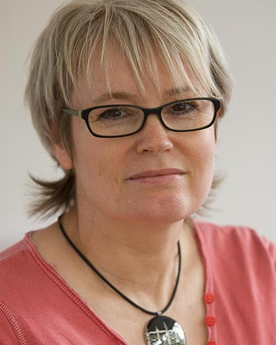
Allison Wiffen works out of her North Yorkshire studio making gorgeous jewellery from the finest white ceramic. She uses text and graphic imagery to create striking yet delicate pieces, and the clay has a lovely creamy richness which complements her imagery.
What got you started making / creating your designs / products?
I was photographing a lot of architectural details and when I started making jewellery and I thought wouldn’t it be cool to have these images on pendants, brooches and cufflinks?
How would you describe your designing / creating style?
My style is graphic and a bit retro.
What is your motto?
Making miniature works of art
What was your first success with your designs / products?
I made a range of jewellery featuring drains, manhole covers, station roofs and railings that I had photographed in London. I put these out at the Open Studios in Cockpit Arts and people loved them, I then took them to a trade show which led to commissions for a number of bespoke ranges.
Tell us about your design process.
With The Globe I start with my favourite quotations. I did English at A level and also did a subsidiary Shakespeare course at university so I do know quite a lot of plays. I then look for a graphic look that somehow captures the feeling evoked by those words: romantic, scary, playful, contemplative. Usually I use a typeface, sometimes a mix of typefaces, and sometimes I hand letter things.
How important is the environmental sustainability of your products?
Ceramics is a product that lasts a long time, but in a good way, so many of my products may well outlive me. Ultimately the ceramic and the metal part will go back to the earth, and I am currently looking at changing the packaging I use so that it is card and more environmentally friendly.
What has been your most interesting commission?
Following the London Olympic Games I was approached by the Olympic Delivery Authority who commissioned a selection of jewellery to be given to the 100 + individuals who stayed on after the games to work on the development of the Olympic park. Accommodation for athletes was turned into flats with parkland,cycle paths and lakes. I took photographs and produced a number of designs for brooches, cufflinks and pendants which people could choose from. A number of the images were from tower blocks. When you saturate the colour and intensify the contrast you end up with a really beautiful abstract image which is recognisable only to the people who knew the buildings and where the image originally came from. I wanted to make something that obliquely referenced the Olympic Park and something that was funky and looked good and that people would actually want to wear and own.


